This is in a basic sense an exploration into
using illustration as opposed to photography.
Rather than the clean, modern photographic
style that the foodie culture has adopted we were thinking of looking at the
more hand-made, crafted side. This is because photos would most likely seem
like too much on the package, especially for a biscuit and because our product
has a lot of life to it through the crazy flavours so the loose, lively
illustration feel could work well. There is a huge hand crafted feel in the
text style, which is used as an image in itself. We wanted to do some research
into illustration in packaging to see what is too much detail, too simple, too
kid-like or too much.

Caviston’s Coffee cup wrap design – The
illustrations are very simple and I like the use of very few colours. The use
of illustrations as well as hand drawn text and every other element makes the
design feel like a coherent piece, almost like a piece of art rather than a
coffee cup design. This isn’t a bad thing, but maybe not a great thing either
as there is not much focus on the actual important elements, such as the brand
name, because of the saturation of detail.

Gargoyle Beer – I like the single colour
design, the purple compliments the natural cardboard colour nicely. The detail
in this design is huge and the main elements, the gargoyle, the brand name, and
then the flavour, use more solid colours to grab the attention of the eye and
create a focal point. It works very well. I like the idea of a patterned
background behind a main image, even if it’s just text, if done right it can
add interest without being too overwhelming while still leaving all focus with
the main image and header, it ends up being the last element you look at yet it
is still taken in and effects the mood long before.

Folksaga Vodka – I really like the use of
very simplified block shapes to create a quite complex image and story. The
images each only use three different colours and still get across a detailed
image, without looking at all overwhelming like a photo could. An upside to a
design like this is that when you are not looking directly at it you just see a
nice abstract design rather than having a detailed photograph, fight for your
attention.
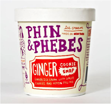
Phin and Phebes Ice Cream – This design takes
on a completely illustrative style, every element is drawn. It has quite a cool
feel to it as the artist has drawn everything fairly simply, no tone or
anything, just flat and it appears as if they design is covered in doodles,
which brings a real personal, unique touch to the brand. The inconsistency of
the font is a really nice touch too, the style as a whole brings a feeling of
quality, honesty and energy.
Deconstructed Sandwich Art (not packaging) – I
thought this design could be relevant to the illustrations if it came to
illustrating the actual ingredients. It is done in an interesting style, there
is depth but only use of flat colours. The deconstructed look is really cool
too, it adds a real sense of honesty and freshness/health, it’s saying to
everyone “look this is what we’re made of, this and nothing else.”
The Pepper Family Art (not packaging) – This
is another design I found that I thought could be useful for illustrating ingredients; it is an extremely simple way and fits the
‘foodie style’ quite well. The faces are interesting, I would have expected
more of a childish feel but it is actually quite sophisticated which is hard to
do. The faces help to bring some life to the peppers and create a mood very
simply.